Could be better, could be worse.
As Olympic orientation camps get under way this week, many of the new unis that the teams will wear are being unveiled. On Tuesday, Nike revealed the uniforms for the 2014 American Squad, to mixed results.
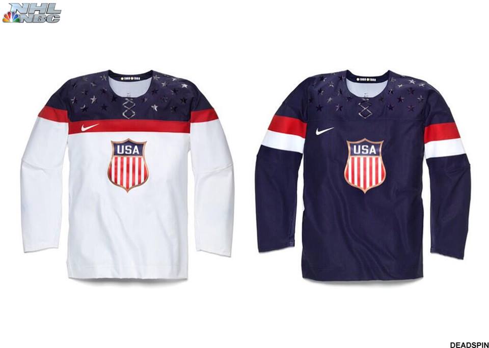
The jerseys continue the trend of Edge® style moisture wick design, however, these two have something of a euro influence, perhaps more common on the football pitch than in the hockey rink. The two-tone design of the white jersey clearly displays this quality more prominently, but both are seemingly soccer influenced.
The patch is evocative of the 1932 USA jersey, used in Lake Placid. This is where it starts to get weird, however. The cheap, screen-printed look of both the navy-on-navy stars and the faux-lace neck area leave much to be desired, in my opinion. Why not just have a real tie on the neck?
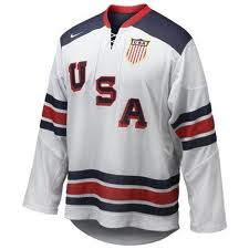
The names and numbers retain the same font as used in the past few Olympics, which I always felt were a little too sleek looking for a country with a rich hockey history and plenty of throwback influences (see the gorgeous 1980 jersey used in 2010, above.)
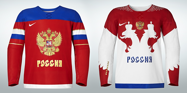
The Russians are the only other country who have unveiled their jerseys so far (see above), but it will be interesting to see what directions the other countries go. As for the USA, I think overall it’s not half bad, but by no means a homerun. What do you guys think?
Share:
More About:International Hockey